UX & Visual Designer

Case Study
Case Study
Case Study
Brand Identity · Typography · Visual Design
Tuba – Restaurant Rebrand
This conceptual rebrand for TUBA Restaurant explores how visual identity can communicate warmth, authenticity, and cultural heritage through modern branding.
Inspired by the meaning of “Tuba,” a heavenly tree in Turkish culture, I developed a visual identity system centered around nourishment, roots, hospitality, and handcrafted cuisine. Through logo exploration, typography studies, color development, and branded applications, the final identity balances organic forms with modern typography to create a brand experience that feels warm, refined, and deeply rooted in tradition.
Identity Exploration
I started the project by exploring visual and cultural themes connected to Turkish cuisine, hospitality, and the meaning behind the word “Tuba.” Through brainstorming, symbolic research, and sketch ideation, I explored concepts inspired by shared meals, warmth, craftsmanship, and traditional cooking.
As the process evolved, I experimented with multiple visual directions, including tree forms, cookware, and food-related symbols. The tree-ring concept ultimately felt like the strongest representation of the brand because it symbolized growth, history, nourishment, and strong roots, qualities that reflect both the restaurant’s story and dining experience.

Ideation through word list, symbolic research and hand sketches
Logo Iterations
I explored several logo directions before refining the final identity system. Early concepts focused on symbolic forms connected to Turkish cuisine and hospitality, including cookware illustrations, typography treatments, and organic shapes inspired by nature.
Through iteration and refinement, the tree-ring symbol emerged as the strongest visual direction because it communicated both the meaning behind the name and the restaurant’s warm, rooted identity.
Logo Iteration #1
Logo Iteration #2
Logo Iteration #3
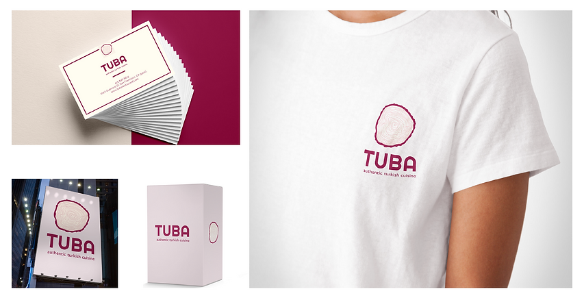
Final Identity System
The final identity combines organic linework with modern geometric typography to create a visual system that feels welcoming, elevated, and contemporary.
The tree-ring symbol became the foundation of the brand language, supported by a warm color palette and clean typographic hierarchy designed to balance authenticity with modern simplicity.

I selected a combination of geometric and highly legible typefaces to create a visual identity that feels modern, approachable, and refined. Righteous was chosen for the primary logo typography due to its distinctive character and strong visual presence, while Gill Sans supports the secondary brand messaging with clarity and balance. Raleway, used across general brand applications in multiple weights and styles, helps establish a cohesive and versatile typographic system throughout the identity.

The final color palette combines warm magenta tones with soft neutral shades to create a visual identity that feels inviting, vibrant, and refined. The balance of rich and light colors helps communicate the restaurant’s warm hospitality while adding a contemporary and elevated character to the brand.
Final Logo Black & White
Final Logo Gray Scale
Final Logo in Color
Brand Applications
The visual identity was extended across packaging, stationery, signage, and apparel applications to create a cohesive and recognizable brand experience.
Each application was designed to maintain the warmth and simplicity of the identity system while bringing the restaurant’s personality into both physical and environmental touchpoints.